CSS `mask-image`: In-Depth Guide to Usage and Best Practices
Introduction to mask-image
CSS masking allows developers to hide parts of an element without permanently deleting those portions (CSS Masking). The mask-image property in CSS enables this by letting you use an image (including SVG or CSS gradients) as a mask layer over an element (Apply effects to images with the CSS mask-image property).
In practice, the mask’s transparency controls which parts of the target element are visible: fully transparent areas of the mask hide those parts of the element, while opaque areas show the element beneath (mask-image - CSS: Cascading Style Sheets). This technique is powerful for creating creative visual effects – you can achieve complex shapes, fades, and cutouts without needing to edit the source image in an external editor (Apply effects to images with the CSS mask-image property).
One major benefit of mask-image is that it’s applied purely with CSS, meaning you can easily update or animate it and combine it with other styles. The syntax and supporting properties of CSS masks are very similar to CSS backgrounds (for example, you can use mask-repeat, mask-position, and mask-size analogous to background properties) (CSS Masking). This makes it relatively easy for developers familiar with background images to get started with masks. By default, the mask uses the alpha channel (opacity) of the mask image to determine the element’s visibility, but you can adjust this behavior (for example, using luminance masks) with additional properties if needed.
In summary, mask-image provides a way to apply an alpha mask to any HTML element, controlling its visibility in sophisticated ways. This opens the door to designing ornate shapes, gentle fades, and layered effects directly in code. As of late 2023, CSS masking has become broadly supported across modern browsers (mask-image - CSS: Cascading Style Sheets), making mask-image a viable tool in production for enhancing visual design while keeping markup clean.
Comparisons with Similar Properties
CSS offers multiple techniques for shaping or compositing elements. It’s important to understand how mask-image differs from other, somewhat related, properties like clip-path and background-blend-mode, so you can choose the right tool for each use case.
mask-image vs clip-path
clip-path also hides portions of an element, but it works very differently from masking. When you clip an element using clip-path, any part of the element outside the specified clip shape becomes fully invisible (not rendered at all) with hard edges (Apply effects to images with the CSS mask-image property). The clipping is defined by vector shapes (circles, polygons, etc.), meaning clip-path is great for simple geometric cropping. However, it doesn’t support partial transparency or soft transitions – the clipped region is either 100% visible or 100% gone.
mask-image, on the other hand, uses an image or gradient as an overlay to determine visibility. This means it can create feathered edges, soft gradients, and complex transparency patterns, not just basic shapes. The main difference is that mask-image works with images and gradients (and thus can leverage opacity levels), whereas clip-path works with vector paths and results in a binary mask (CSS Masking). For example, if you want to gradually fade out an image at the edges or have a complex shape with a blurred border, mask-image is the appropriate choice. With clip-path alone, such effects would be impossible because clipped areas don’t allow partial opacity.
In use, you might reach for clip-path when you need to create a non-rectangular shape in the simplest way (e.g., making an image a circle or polygon) and you don’t need any transparency gradient. It’s straightforward and has good support for shapes. Use mask-image when you need more creative control: e.g. applying a detailed mask texture, a gradient fade-out, or any scenario where portions of the element should be semitransparent rather than completely gone. It’s worth noting you can even combine masking and clipping for advanced scenarios, but generally these properties serve different needs. As a rule of thumb, use clip-path for simple geometric cropping, and mask-image for intricate masks and transparency effects.
mask-image vs background-blend-mode
background-blend-mode is a property that affects how an element’s background layers blend with each other and with the element’s background color (background-blend-mode). This is fundamentally different from what mask-image does. background-blend-mode doesn’t hide any part of an element; instead, it mixes colors of backgrounds (for example, if you have multiple background images stacked, you can blend them with modes like multiply, screen, overlay, etc.). It’s akin to Photoshop’s layer blending, applied to CSS backgrounds.
In contrast, mask-image controls transparency of the element’s content by overlaying an image mask. There is no color blending involved – the mask simply dictates where the element is opaque, partially transparent, or fully transparent. For instance, if you wanted to achieve a duotone or color overlay effect on an image, you might use blending modes; but if you wanted to shape that image into a star or fade it out, you would use masking.
To illustrate, consider an image that you want to appear as if it’s painted onto a textured background. Using background-blend-mode: multiply might allow the image’s colors to mix with a texture pattern behind it. However, the image’s shape remains a rectangle. If you instead use a texture image as a mask-image, you could actually make the image itself take on the texture’s shape (parts of the image would be transparent based on the mask). In summary, use background-blend-mode for blending colors/layers for stylistic color effects, and use mask-image when you need to define a custom transparency pattern or shape for an element. They can even be used together (for example, an element could have blended background layers and also a mask applied), but they solve different problems and are not interchangeable.
Implementation Examples
Nothing beats real examples to demonstrate how mask-image works. In this section we’ll explore a few scenarios: using pure CSS to apply masks in different ways, and then using JavaScript/React to dynamically update masks.
Pure CSS Masking Examples
Let’s start with some pure CSS examples that showcase different ways to use mask-image. These examples assume you have some element (image or text or a div with background) that you want to mask.
Example 1: Gradient Fade-Out Mask (Image Fade Effect) – Suppose you have an image and you want it to gradually fade to transparent at the bottom (a common UI effect for scrolling containers or simply styling). You can achieve this with a CSS gradient as the mask:
<div class="fade-image">
  <!-- This div uses a background image to demonstrate the mask effect -->
</div>
.fade-image {
width: 300px;
height: 200px;
background: url('photo.jpg') center/cover no-repeat;
/* Apply a top-to-bottom gradient mask: fully opaque at top, transparent at bottom */
mask-image: linear-gradient(to bottom, black 60%, transparent 100%);
mask-size: 100% 100%;
mask-repeat: no-repeat;
/* For broader support (Safari), include the WebKit-prefixed version: */
-webkit-mask-image: linear-gradient(to bottom, black 60%, transparent 100%);
-webkit-mask-size: 100% 100%;
-webkit-mask-repeat: no-repeat;
}In this code, mask-image: linear-gradient(to bottom, black 60%, transparent 100%) creates a gradient that is solid black at the top 60% of the element and fades to fully transparent at the bottom. Because by default the mask uses the alpha channel (and black is fully opaque), the top portion of the element remains visible, while the bottom gradually becomes transparent. The result is the image smoothly fading out towards the bottom. We set mask-repeat: no-repeat and mask-size: 100% 100% to ensure the gradient covers the whole element once (just like one would do for a background image to avoid tiling). The syntax for these mask properties is analogous to their background counterparts (e.g., mask-size: cover would function like background-size: cover (Apply effects to images with the CSS mask-image property | Articles | web.dev)). The prefixed -webkit-mask-* lines are included for Safari and older WebKit browsers that require the prefix.
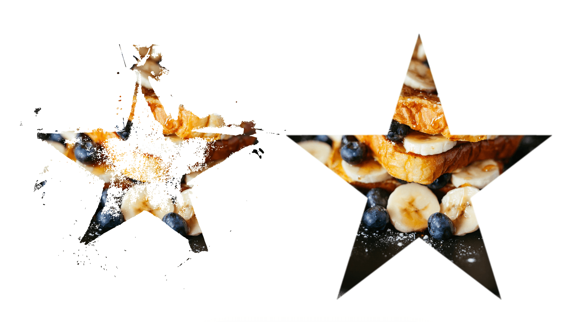
Example 2: Image Mask (Shaping an Element with a Mask Image) – Now let’s use an actual image as a mask. Imagine you have a decorative shape (say a star silhouette) as a PNG or SVG, and you want an element (for example, a photo or even a block of content) to appear only within that star shape. Here’s how you could do it:
<div class="star-mask">
  <!-- This div could contain content or have a background image that will be masked -->
</div>
.star-mask {
width: 300px;
height: 300px;
background: url('picture.jpg') center/cover no-repeat;
mask-image: url('star-shape.png');
mask-mode: alpha; /* ensure we use the alpha channel of the PNG */
mask-repeat: no-repeat;
mask-position: center;
mask-size: contain;
-webkit-mask-image: url('star-shape.png'); /* Safari prefix */
-webkit-mask-repeat: no-repeat;
-webkit-mask-position: center;
-webkit-mask-size: contain;
}Here, mask-image: url("star-shape.png") uses an external image file (which should have transparency) as the mask. Typically, a mask image like this would be a black shape on a transparent background (or any fully opaque shape – the color doesn’t matter, only the alpha channel does when mask-mode: alpha). The CSS above will confine the visibility of .star-mask’s background image into the star silhouette. We use mask-size: contain so that the mask image is scaled to fully fit within the element’s area (preserving its aspect ratio), and mask-position: center to align it centrally. The result is that the photo in the background will only show through where the star shape has opaque pixels; everything outside the star shape will be transparent, effectively cutting the photo into a star form. Just like with backgrounds, you can adjust mask-position and mask-size to get the mask placement and scale right (in fact, the mask positioning syntax is identical to background positioning syntax (CSS Masking)). Again, we include WebKit-prefixed versions for compatibility.
Example 3: Combining Multiple Masks (Advanced) – The CSS masking spec allows multiple mask layers, similar to multiple backgrounds. While less common, you might sometimes layer masks for complex effects. For instance, you could use two masks: one raster image and one gradient. The browser will composite them (by default, intersecting their alpha channels). In CSS, it looks like:
.multi-mask-example {
  /* ... element styles ... */
  mask-image: url('texture-mask.png'), radial-gradient(circle, transparent 30%, black 100%);
  mask-composite: add; /* how multiple masks combine; default is add which essentially multiplies alpha */
  mask-repeat: no-repeat, no-repeat;
  mask-position: center, center;
  mask-size:
    cover,
    100% 100%;
}
In this snippet, the element is masked by both a texture image and a radial gradient (perhaps creating a vignette effect where the edges fade out and also a texture cuts through). The details of mask-composite are beyond our scope here, but note that multiple masks can achieve very intricate visuals. In practice, you’ll more commonly use one mask at a time, but it’s good to know this layering is available for advanced use cases.
Dynamic Mask Updates with JavaScript and React
Masks can be manipulated dynamically just like any other CSS property. This means you can use JavaScript (or framework code) to change the mask-image on the fly — for interactive effects, theme toggles, or animations.
Using Vanilla JavaScript: You can toggle or animate a mask by changing the element’s style or class. For example, imagine a profile picture that on hover changes from a circle mask to a star mask. You might have two CSS classes defined (one with a circular gradient mask, one with a star SVG mask). In JavaScript, you could listen for hover or click events and switch the class:
.image-container {
  position: relative;
  border: 1px gray solid;
}
.image-container img {
  display: block;
  /* Apply a top-to-bottom gradient mask: fully opaque at top, transparent at bottom */
  mask-image: linear-gradient(to bottom, rgb(161, 161, 161) 0%, transparent 100%);
  mask-size: 100% 100%;
  mask-repeat: no-repeat;
}

.image-container img.follow-mask {
  display: block;
  width: 100%;
  height: auto;
  mask-image: url('./pawn.webp'), radial-gradient(circle, transparent 10%, black 100%);
  mask-composite: add;
  mask-size: 300px 300px;
  mask-repeat: no-repeat;
}<div class="image-container">
<img src="./chessboard.webp" width="100%" />
</div>document.addEventListener('DOMContentLoaded', () => {
const image = document.querySelector('.image-container img');
image.addEventListener('mouseenter', e => {
image.classList.add('follow-mask');
});
image.addEventListener('mousemove', e => {
const rect = image.getBoundingClientRect();
const x = e.clientX - rect.left;
const y = e.clientY - rect.top;
image.style.maskPosition = `${x - 150}px ${y - 150}px`;
});
image.addEventListener('mouseleave', () => {
console.log('here');
image.classList.remove('follow-mask');
image.style.maskPosition = '0px 0px';
});
});In this hypothetical code, when the user hovers over the img element, we add a class that swaps the mask to a pawn shape. On mouse leave, we remove that class, returning to the original mask. The CSS transition on mask-image provides a smooth interpolation (note: not all browsers may interpolate complex masks smoothly, but simple gradient transitions can work).
You can also directly set the style in JavaScript. For example:
element.style.maskImage = 'url("mask2.png")';
element.style.webkitMaskImage = 'url("mask2.png")';
This would immediately change the mask on that element (here we assign both standard and WebKit-prefixed properties for compatibility). This approach is useful if the mask value is dynamic or calculated in script.
Using React (or other frameworks): In React, you can control mask-image via state or props just like any other style. Here’s a simple example of a React component that lets a user toggle between two masking effects on an image:
import React, { useState } from 'react';
import './styles.css';

function App() {
  const [maskShape, setMaskShape] = useState('circle');

  const handleShapeChange = shape => {
    setMaskShape(shape);
  };

  return (
    <div className="App">
      <div className="button-container">
        <button onClick={() => handleShapeChange('circle')}>Circle</button>
        <button onClick={() => handleShapeChange('rectangle')}>Rectangle</button>
        <button onClick={() => handleShapeChange('triangle')}>Triangle</button>
      </div>
      <div className="image-container">
        <svg width="0" height="0">
          <defs>
            <mask id="circle-mask" maskUnits="objectBoundingBox">
              <circle cx="400" cy="50" r="120" fill="#FFFFFF" />
              <circle cx="100" cy="50" r="120" fill="#FFFFFF" />
            </mask>
            <mask id="rectangle-mask" maskUnits="objectBoundingBox">
              <rect width="130" height="130" fill="#FFFFFF" />
              <rect width="130" height="130" y="120" x="120" fill="#FFFFFF" />
              <rect width="130" height="130" y="0" x="220" fill="#FFFFFF" />
              <rect width="130" height="130" y="120" x="320" fill="#FFFFFF" />
            </mask>
            <mask id="triangle-mask" maskUnits="objectBoundingBox">
              <polygon points="200,0 0,85 200,205" fill="#FFFFFF" />
              <polygon points="400,0 200,85 400,205" fill="#FFFFFF" />
            </mask>
          </defs>
        </svg>
        <img src="chessboard.webp" alt="Masked" className={`masked-image ${maskShape}`} />
      </div>
    </div>
  );
}

export default App;
.App {
text-align: center;
}
.button-container {
margin: 20px;
}
.image-container {
display: inline-block;
position: relative;
}
.masked-image {
width: 500px;
transition: mask-image 0.5s ease-in-out;
}
.masked-image.circle {
-webkit-mask-image: url(#circle-mask);
mask-image: url(#circle-mask);
}
.masked-image.rectangle {
-webkit-mask-image: url(#rectangle-mask);
mask-image: url(#rectangle-mask);
}
.masked-image.triangle {
-webkit-mask-image: url(#triangle-mask);
mask-image: url(#triangle-mask);
}In this React component, we maintain a piece of state mask that determines which mask style to apply. Clicking the button toggles the mask state between 'circle', 'rectangle' and 'triangle', which updates the style of the image accordingly (thanks to React re-rendering with the new state). This results in the element switching its mask shape on button clicks. You could extend this idea to many other interactive scenarios: adjusting a mask based on scroll position, using an input range slider to change a gradient mask’s intensity, etc.
Animation Note: It’s possible to animate mask properties using CSS animations or transitions (as shown with the transition on hover). However, not all aspects are trivial to animate – for instance, animating a complex SVG mask image swap might just jump from one to the other. Gradients can often be animated by adjusting stops or coordinates. If you need more fine-grained animated masking, consider techniques like animating an SVG <mask> element or using the mask-position to slide a mask image. Keep in mind performance (discussed more below) when doing animations: moving or changing a mask frequently can be more performance-intensive than standard CSS transforms or opacity changes.
Use Cases
Now that we’ve seen how to use mask-image, when should you use it? Here we’ll cover scenarios where mask-image shines, and some best practices to consider.
When and Why to Use mask-image
Non-rectangular or Complex Shapes: Any time you want an element to take a shape that isn’t easily done by CSS shapes alone, a mask can help. For example, making an image into a star, a heart, letter shapes, or even an arbitrary silhouette. While some simple shapes (circle, ellipse, polygon) can be done with clip-path or border-radius, mask-image lets you use any image as a stencil, meaning your shapes can include soft edges, holes, or intricate outlines. Designers often create PNG/SVG masks for things like unique image frames, user avatar shapes, or decorative section transitions. With mask-image, these designs can be implemented in the browser easily. You can even mask text or entire blocks of content to appear within a shape (for instance, showing text only where a grunge texture mask has holes, creating a distressed text effect).
Gradual Fades and Transparency Effects: If you need part of an element to smoothly fade out or become partially transparent, masking is the go-to solution. A classic use case is fading out the bottom of a scrollable container’s content (to indicate overflow), or fading the edges of a slideshow image into the background. You simply overlay a gradient mask as we did in the example, rather than relying on an actual image editor to pre-fade the image. This makes the effect flexible (you can adjust it with CSS or turn it on/off with a class) and responsive (the mask will scale with the element if set appropriately). It’s much more adaptable than a static image that has a fade baked in. In general, any effect where you want variable opacity across an element (not just one global opacity) is a candidate for mask-image.
Text and Icon Styling: Masks aren’t just for photos/divs; you can apply them to text elements too (since text is rendered in the DOM, you can mask a text span or heading). This can yield some very interesting typography effects – for example, making text appear with a gradient fade, or in a cut-out style where a texture shows through the text shapes. One approach to fancy text is using background-clip: text with a background image, but mask-image on a text element can achieve different results (like making only certain parts of the letters visible). Similarly, for icons (which might be fonts or SVGs), you can apply a mask to create an icon stencil effect. A practical example might be an icon that serves as a mask for a photo gallery (showing the photo through the icon shape). The possibilities are quite broad wherever graphical styles are concerned.
Interactive Reveals and Hover Effects: Because you can animate and change masks, mask-image can be used for interactive effects like hover reveals or transitions. For instance, on a portfolio site, you could hover over a project thumbnail and have it transition from a plain rectangle to a complex shape via an animated mask, drawing attention in a unique way. Another example is clicking a button that causes an overlay mask to animate and reveal some content underneath in a stylish wipe effect. These kinds of effects can make use of CSS animations on mask properties or JavaScript-driven updates as demonstrated. They allow for creativity beyond simple fades or slides—imagine a newspaper burning away effect achieved by animating a mask that looks like burnt edges, etc.
To sum up, use mask-image when you need fine-grained control over element visibility that goes beyond uniform opacity or basic shape clipping. It excels in creating eye-catching visuals like transparent cutouts (e.g., a button with a cut-out text so you see through it) (Masking images in CSS with the mask-image property - LogRocket Blog), image filters or overlays by layering masks (for example, using a grayscale mask to selectively desaturate parts of an image) (Masking images in CSS with the mask-image property - LogRocket Blog), and generally any time you’d reach for Photoshop to mask something – now you can often do it in CSS.
Best Practices (Performance and Accessibility)
While mask-image is powerful, it’s also a fairly advanced feature under the hood. Here are some best practices to ensure you use it in a performant and accessible way:
-
Keep Masks Simple When Possible: The browser has to calculate the masking effect pixel by pixel. Simple masks (like basic gradients or small mask images) are usually fine. But very large or complex masks (especially if you are animating them) can tax the browser’s rendering pipeline. For example, one developer reported that animating a dotted mask (using a repeating radial-gradient) caused a major frame rate drop in Firefox (The Two Lines of CSS That Tanked Performance (120fps to 40fps)). If you notice performance issues, consider simplifying the mask (e.g., lower resolution image or less frequent animation) or toggling the effect only when needed. Also, CSS masks might be hardware accelerated in some browsers but not others – test across your target browsers.
-
Avoid Constant Repainting if Not Needed: If you animate a mask by changing
mask-positionor swapping images rapidly, you’re triggering repaints of the content. Where possible, use CSS transitions and let the browser optimize it. If using JavaScript, throttle rapid changes (for instance, userequestAnimationFramefor smooth updates). And if an effect is only decorative, you might disable it on lower-end devices or browsers that struggle (as in the example where the animation was turned off for Firefox due to performance issues (The Two Lines of CSS That Tanked Performance (120fps to 40fps))). Always consider using theprefers-reduced-motionmedia query to turn off elaborate mask animations for users who opt out of motion – this not only aids those users but can improve performance in those cases too (as seen in our code example where we disabled the animation in such scenarios). -
Provide Fallbacks or Graceful Degradation: Not all browsers support
mask-image(see compatibility below). Ensure that if the mask isn’t applied, the content is still presentable. Usually, if a mask isn’t supported, the element will just display normally (unmasked), which is often acceptable. But double-check that a missing mask doesn’t ruin the design. For example, if you intended white text on a dark background to show through a cut-out mask, and the mask fails, you might end up with white text on white background. In such cases, use feature queries (e.g.,@supports (mask-image: url()) { ... }) to apply alternate styling or ensure the base styling works without the mask. Including the-webkit-mask-imageprefix is essential for Safari and older Chrome — we saw in examples how to include those. For broad coverage you might also include-moz-mask-imageand-o-mask-imageeven if they’re not standard, as some documentation suggests (Masking images in CSS with the mask-image property - LogRocket Blog) (Firefox uses the unprefixed property as of its modern versions, and Opera follows WebKit prefixes historically). -
Accessibility – Consider the Impact of Hiding Content: Masks are purely visual and do not remove content from the DOM or from assistive technology. In fact, the masked element’s hidden parts still exist in terms of layout and hit-testing – the mask doesn’t change the element’s actual geometry (CSS Masking Module Level 1). This has a few implications:
- For screen reader users, if you mask out part of content (for example, masking half of an image), the screen reader will still read the image’s alt text in full. Usually this is fine (they’ll just get the description, which is what you want). But be cautious if you were relying on a mask to hide something like visible text; that text might still be read out. If you truly want content to be inaccessible, don’t rely on a mask – use proper hiding techniques (like
aria-hidden="true"or not rendering it). - For pointer interactions, a masked element still intercepts clicks in the area of the element’s box, even if that area is fully transparent due to the mask. For example, if you have a star-shaped masked button, the corners of the button (outside the star but within the bounding box) are transparent but will still block clicks to whatever is behind the button. Users will likely not try clicking through a visible button’s bounding box, but if you have overlapping elements or such, be mindful that masks don’t create actual holes for the mouse. If needed, adjust pointer-events or layout. A common approach for irregular interactive shapes is to use an
<svg>with an actual<mask>or<clipPath>for pointer precision, or just accept the rectangular hit area. - Ensure that the purpose of the mask is decorative/enhancing, and doesn’t convey information that some users might miss. For example, if the fact that an image has a jagged torn-paper mask edge is important to understanding content, that might not translate to non-visual users. Usually masks are aesthetic, so this isn’t a big issue, but it’s worth keeping in mind.
- For screen reader users, if you mask out part of content (for example, masking half of an image), the screen reader will still read the image’s alt text in full. Usually this is fine (they’ll just get the description, which is what you want). But be cautious if you were relying on a mask to hide something like visible text; that text might still be read out. If you truly want content to be inaccessible, don’t rely on a mask – use proper hiding techniques (like
-
Optimizing Mask Images: If you use external images (PNG/SVG) as masks, optimize their size and complexity. For PNG, use an 8-bit alpha PNG if possible (unless you need full color in the mask, which typically you don’t if just using alpha). Large masks (e.g., a huge PNG) can slow down rendering; if the mask image is much larger than needed, consider scaling it down. SVG masks can be more efficient for scalable designs and usually are lighter in file size for geometric shapes. They also can be inlined in HTML and referenced via
mask-image: url(#maskID)on the same page (though cross-browser support for that can vary). Test different formats – an SVG mask might render faster than a PNG in some cases since it’s vector. Also, caching: remember that mask images, if external, load just like any asset. If you reuse the same mask on multiple elements, it’s actually good for performance (one image, multiple uses). But if you have many different large mask images, that’s extra network and memory overhead.
In summary, use mask-image thoughtfully: it’s best for embellishment, not for core layout structure. Ensure your UI is still functional and understandable without the masks (for those who can’t see them or if they don’t load), and then enjoy the enhanced visuals when masks are available. With prudent use, you can get striking effects without significant downsides.
Browser Compatibility
The mask-image property was considered an experimental part of CSS for quite some time, but it’s now part of the official CSS Masking Module Level 1 and is supported in all major modern browsers (with some caveats for older versions). As of the end of 2023, unprefixed mask-image is supported by current versions of Chrome, Edge, Firefox, and Safari (mask-image - CSS: Cascading Style Sheets | MDN).
In practice, this means if you write mask-image in your CSS, it will work in up-to-date browsers on both desktop and mobile. However, to be safe and cover slightly older browsers, you should include the WebKit-prefixed version. Most features of mask-image were available behind the -webkit-mask-image prefix in Safari and older Chrome/Android browsers.
Here’s a quick compatibility rundown:
- Chrome – Fully supports
mask-image(unprefixed) in recent versions. Earlier versions (from Chrome 4 up to around Chrome 68) supported only-webkit-mask-imagefor certain functionalities (especially for gradient masks) (Mask-image - CSS - W3cubDocs). Chrome 79+ has solid unprefixed support. - Firefox – Supports unprefixed
mask-imagefrom Firefox 53 onward (Firefox 53 was the first to enable it by default). No prefix needed. - Safari (Desktop and iOS) – Requires the
-webkit-prefix for mask properties up until Safari 15.4. From Safari 15.4 and iOS 15.4 onward, unprefixedmask-imageshould work (Mask-image - CSS - W3cubDocs). In practice, always include the-webkit-prefix for Safari users who might be on slightly older versions, as many people may not be on the absolute latest. - Edge – EdgeHTML (the old Edge) did not support masks. Modern Edge (Chromium-based, v79+) inherits Chrome’s support, so it supports
mask-imagelike Chrome does (including the same need for prefix in versions before the feature became standard). - Opera – Opera is Chromium-based as well, so similar story to Chrome (and historically older Opera 15+ would use -webkit- masks).
- Mobile browsers – Android Browser/WebView support followed Chrome’s implementation (with WebKit prefixes in older Android 4.x, and unprefixed now). Firefox for Android supports it as desktop Firefox does. Samsung Internet (which is based on Chromium) has supported masks since version 4.0+ (with -webkit- prefix in older versions).
In summary, to maximize compatibility: use the standard mask-image in your CSS and also include -webkit-mask-image (and related prefixed properties like -webkit-mask-size etc.) (Masking images in CSS with the mask-image property - LogRocket Blog). This dual approach covers Safari and older WebKit browsers. Most modern browsers will just ignore the prefixed version and use the standard one, or vice versa. Also consider using feature queries or graceful degradation as noted in Best Practices. Because support is now widespread, using mask-image is increasingly safe – just keep IE out of your plans, or ensure it doesn’t break the experience there.
External References
For further reading and official documentation on mask-image and related concepts, check out these resources:
- MDN Web Docs – “mask-image” – Mozilla’s official documentation with examples and browser compatibility info (mask-image - CSS: Cascading Style Sheets | MDN).
- W3C CSS Masking Module Level 1 – The formal specification that defines
mask-imageand other masking properties (CSS Masking Module Level 1). - Web.dev Article – “Apply effects to images with CSS mask-image” by Rachel Andrew – Illustrated tutorial on using masks vs clip-path, with examples of image and gradient masks (Apply effects to images with the CSS mask-image property | Articles | web.dev).
- Ahmad Shadeed’s “CSS Masking” – In-depth blog post explaining masking concepts and the difference between CSS masks and clip-path (CSS Masking), with practical demos.
- LogRocket Blog – “Masking images in CSS with the mask-image property” – Guide with use cases, code snippets, and tips on mask-mode, mask-composite, etc., plus compatibility notes (Masking images in CSS with the mask-image property - LogRocket Blog).
SEO Keywords
- CSS mask-image
- CSS masking techniques
- clip-path vs mask-image
- image masking in web design
- CSS mask examples and usage